Microsoft Office Enterprise Management
Product | UX | Strategy
Company
Microsoft
Role
UX Design / UX Research
Timeline
3 months
Office administrators hold a large stake in an organization, they are responsible for helping their information workers be productive and their leadership team be well informed on technology decisions. As Office moves to an applications as a service model, there is an opportunity to re-imagine how Office admins manage devices across large organizations.
In this project, I sought to understand Office admin’s values, pain-points, and needs to create a dashboard that supports their device management within an Microsoft Office management tool for enterprise. During this project, I explored and validated a range of dashboard concepts with Office admins. I created a production ready and north star design and provided Office admins with an overview of their company's device system.
Problem
Microsoft currently has an Office (M365) management product with feature areas that contain significant functionality in their respective locations, but nothing that summarizes, prioritizes and supports the relationship between them.
Design Solution
The dashboard I created supports Office Admins in managing tasks such as deploying Office, resolving performance and compatibility issues, and other critical responsibilities. It leverages AI technology to offer recommendations and introduce new tools that not only promote best practices, but also enhance their overall work experience.
Set context
User background
Office Admins are responsible for managing approximately 40,000 devices in large enterprise companies. Their primary role is to ensure the healthy and secure functioning of Office apps, enabling end users to experience the latest updates of M365. This involves a range of tasks, from managing device deployments to addressing performance and compatibility issues, and implementing necessary security measures.
Subject Matter Expert Interviews
To start my design process and build context of the subject matter, conducted 8 subject matter expert interviews across design, project management, research, and development to learn about the Office Admin persona and Microsoft business goals.
A few of the questions I asked going into my research were:
• What are Office Admins values?
• What do they need for productive work?
• What barriers do they face in their current workflow?
• How can the Office admin center best solve their needs?
v
Insight 1: IT Admin Values
IT admins value a data driven approach to device management. They hold high levels of responsibility in the role managing a wide range of end users devices. They are also cautious to change because making new decisions could be risky for their company.
Finding 2: Top Tasks & Pain Points
Insight 2: Pain Points
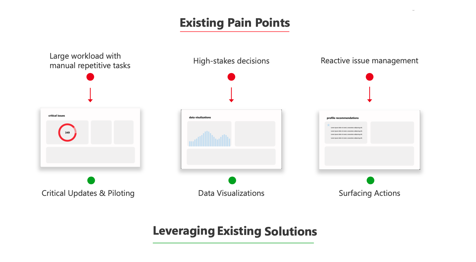
Admins are brudened by pain points in the deployment process. In SME interviews I pin pointed that Office update deplyments are a key task for Office Admins. Before the Admin mamanagment tool redesign an Office Admins could experience at least 5 pain points before a deployment a new M365 update to end users at their company.

Finding 3: Reactive Work Model
Insight 3: Reactive Work Model
The reactive work model is unproductive. Admin's current work model is reactive issue management, a time consuming approach to problem solving when issues arise and costly to a company.

Finding 4: High-Stakes Work
Insight 4: High-Stakes Work
Admin's conduct high-stakes work. Although their current workflow might not be perfect, Office admins are essential to a companies’ success. It is critical that enterprise customers receive top Office performance across their apps.
“If admins break a macro or add-in it could be catastrophic – a company might not be able to make a decision or they might lose major money.” - Fuel Health PM & former IT Worker
Leverage exisitng frameworks
Comparative & product analysis
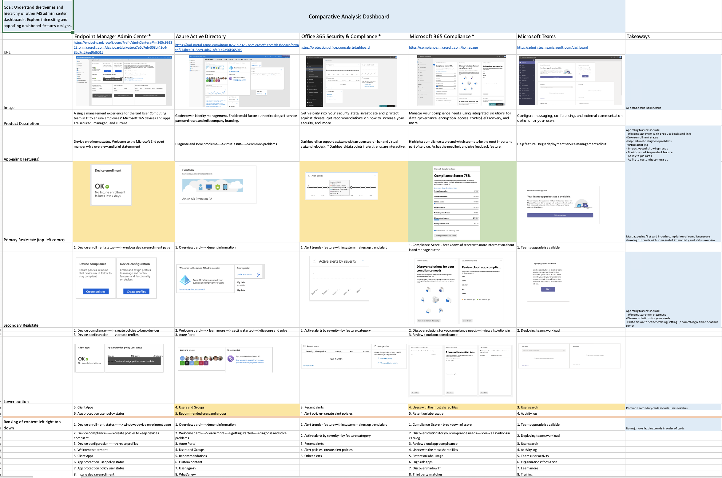
When prioritizing dashboard features and hierarchy, I began by analyzing existing design solutions within the Microsoft ecosystem. This involved conducting a comparative analysis of design patterns and features used in other Microsoft Admin Dashboards. Additionally, I analyzed the patterns and design strategies used by the Moca product design team to solve complex admin issues.
To conduct this analysis, I utilized a 2x2 feature analysis framework and assessed several measures. By analyzing each of these measures and weighing them against one another, I was able to develop a comprehensive understanding of the relative importance and priority of each dashboard feature, and how they should be structured and presented in the final design.
Existing approaches
I also leveraged effective design approaches from other Microsoft admin products, such as data visualization to provide a quick overview of the system and recommedation to allivate recative admin patterns.
Determine scope
Design goals
I made design goals is to establish a clear set of objectives to ensure that the end product meets the needs and expectations of the users. Theses goals helped me to focus their efforts and prioritize the key aspects of the design, while also serving as a reference point for evaluating the success of the design.
1. Must support a practive management workflow.
“Their job is to reduce the number of support tickets [from crashes and sluggish apps] before it becomes a help desk ticket....IT admin would love to know what issues exist before the support tickets come in because that saves time and money”
-Fuel Health PM & former IT Worker
Design Requirement #2
2. Must support Office admin’s productivity and cognitive offloading.
3. Must support the transition to intelligent Office management recommendations (AI).

Design Requirment #3
Design Question
" How might we design a dashboard that supports more efficient resolutions of critical issues, intelligent recommendations, and highlights insights into the Office Admin Center’s key feature areas to optimize admins daily work? "
I created a design question to hone in the precise problem I would be designing for. To do this I generated several design questions and highlighting the user pain points and the intended outcome of the final product. I asked the design team to rank and prioritize the design questions I generated and through affinity diagramming generated the appropriate design questions.
Product Strategy
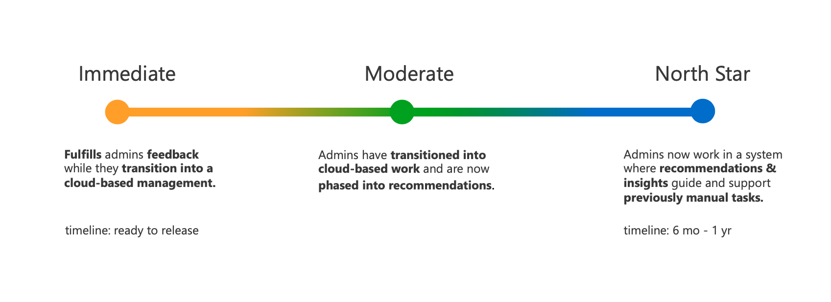
A release strategy was created to a timeframe to address the rollout of dashboard features.


Hey there, this is the default text for a new paragraph. Feel free to edit this paragraph by clicking on the yellow edit icon. After you are done just click on the yellow checkmark button on the top right. Have Fun!
Hey there, this is the default text for a new paragraph. Feel free to edit this paragraph by clicking on the yellow edit icon. After you are done just click on the yellow checkmark button on the top right. Have Fun!
Hey there, this is the default text for a new paragraph. Feel free to edit this paragraph by clicking on the yellow edit icon. After you are done just click on the yellow checkmark button on the top right. Have Fun!
Hey there, this is the default text for a new paragraph. Feel free to edit this paragraph by clicking on the yellow edit icon. After you are done just click on the yellow checkmark button on the top right. Have Fun!
Hey there, this is the default text for a new paragraph. Feel free to edit this paragraph by clicking on the yellow edit icon. After you are done just click on the yellow checkmark button on the top right. Have Fun!
Hey there, this is the default text for a new paragraph. Feel free to edit this paragraph by clicking on the yellow edit icon. After you are done just click on the yellow checkmark button on the top right. Have Fun!
Hey there, this is the default text for a new paragraph. Feel free to edit this paragraph by clicking on the yellow edit icon. After you are done just click on the yellow checkmark button on the top right. Have Fun!
Hey there, this is the default text for a new paragraph. Feel free to edit this paragraph by clicking on the yellow edit icon. After you are done just click on the yellow checkmark button on the top right. Have Fun!
Hey there, this is the default text for a new paragraph. Feel free to edit this paragraph by clicking on the yellow edit icon. After you are done just click on the yellow checkmark button on the top right. Have Fun!
Hey there, this is the default text for a new paragraph. Feel free to edit this paragraph by clicking on the yellow edit icon. After you are done just click on the yellow checkmark button on the top right. Have Fun!
Hey there, this is the default text for a new paragraph. Feel free to edit this paragraph by clicking on the yellow edit icon. After you are done just click on the yellow checkmark button on the top right. Have Fun!
Hey there, this is the default text for a new paragraph. Feel free to edit this paragraph by clicking on the yellow edit icon. After you are done just click on the yellow checkmark button on the top right. Have Fun!
Hey there, this is the default text for a new paragraph. Feel free to edit this paragraph by clicking on the yellow edit icon. After you are done just click on the yellow checkmark button on the top right. Have Fun!
Hey there, this is the default text for a new paragraph. Feel free to edit this paragraph by clicking on the yellow edit icon. After you are done just click on the yellow checkmark button on the top right. Have Fun!
Hey there, this is the default text for a new paragraph. Feel free to edit this paragraph by clicking on the yellow edit icon. After you are done just click on the yellow checkmark button on the top right. Have Fun!
Hey there, this is the default text for a new paragraph. Feel free to edit this paragraph by clicking on the yellow edit icon. After you are done just click on the yellow checkmark button on the top right. Have Fun!
Hey there, this is the default text for a new paragraph. Feel free to edit this paragraph by clicking on the yellow edit icon. After you are done just click on the yellow checkmark button on the top right. Have Fun!
Hey there, this is the default text for a new paragraph. Feel free to edit this paragraph by clicking on the yellow edit icon. After you are done just click on the yellow checkmark button on the top right. Have Fun!
Hey there, this is the default text for a new paragraph. Feel free to edit this paragraph by clicking on the yellow edit icon. After you are done just click on the yellow checkmark button on the top right. Have Fun!
Hey there, this is the default text for a new paragraph. Feel free to edit this paragraph by clicking on the yellow edit icon. After you are done just click on the yellow checkmark button on the top right. Have Fun!
Hey there, this is the default text for a new paragraph. Feel free to edit this paragraph by clicking on the yellow edit icon. After you are done just click on the yellow checkmark button on the top right. Have Fun!
Hey there, this is the default text for a new paragraph. Feel free to edit this paragraph by clicking on the yellow edit icon. After you are done just click on the yellow checkmark button on the top right. Have Fun!
Prototypes & user feedback
Focus Groups & Concept Value Testing
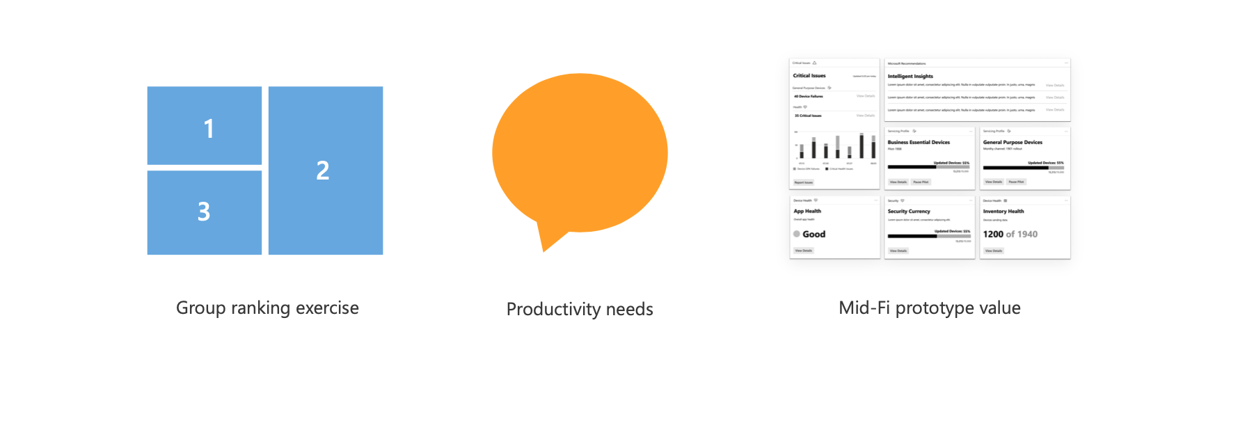
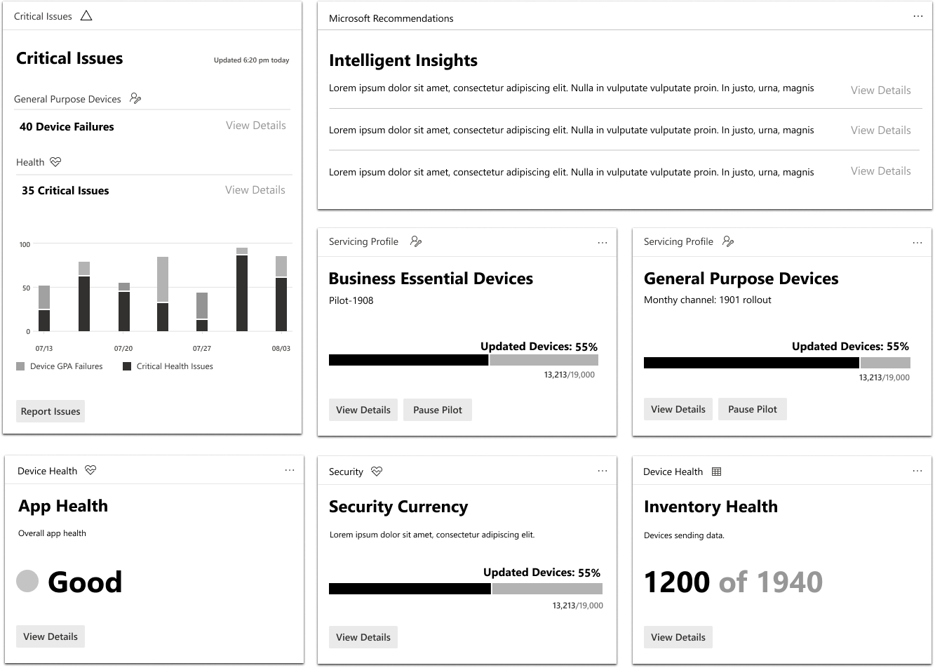
I conducted an informal focus group and concept value testing session with Office Admins. The goal of this session was to understand the admins preferences and priorities, to guide and validate the design direction of the dashboard. In the session we did a feature priority ranking exercise, discussing topics such as, most frequently performed tasks and painpoints they experience in their daily work. During theses sessions also shared a lo-fi prototype for concept value testing.
Findings
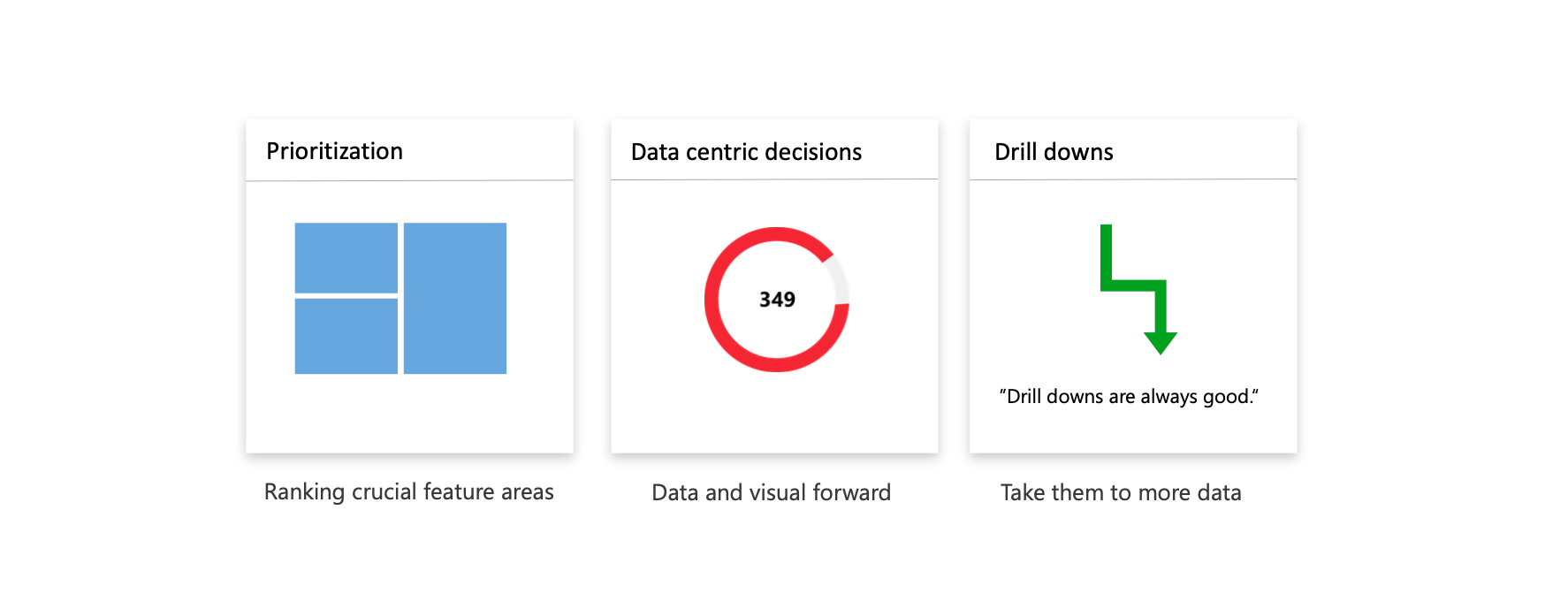
Admins stressed that seeing critical updates across the devices they manage is their top prioroty on the dashboard. However, they are hesitant to take quick resolutions to solve warnings off the dashboard. They are also data centric and need to see both data visualizations and number to support important feature area updates, and lastly they want to be led to device level data or drill downs. These insights were informative to determining design next steps.
User Flows
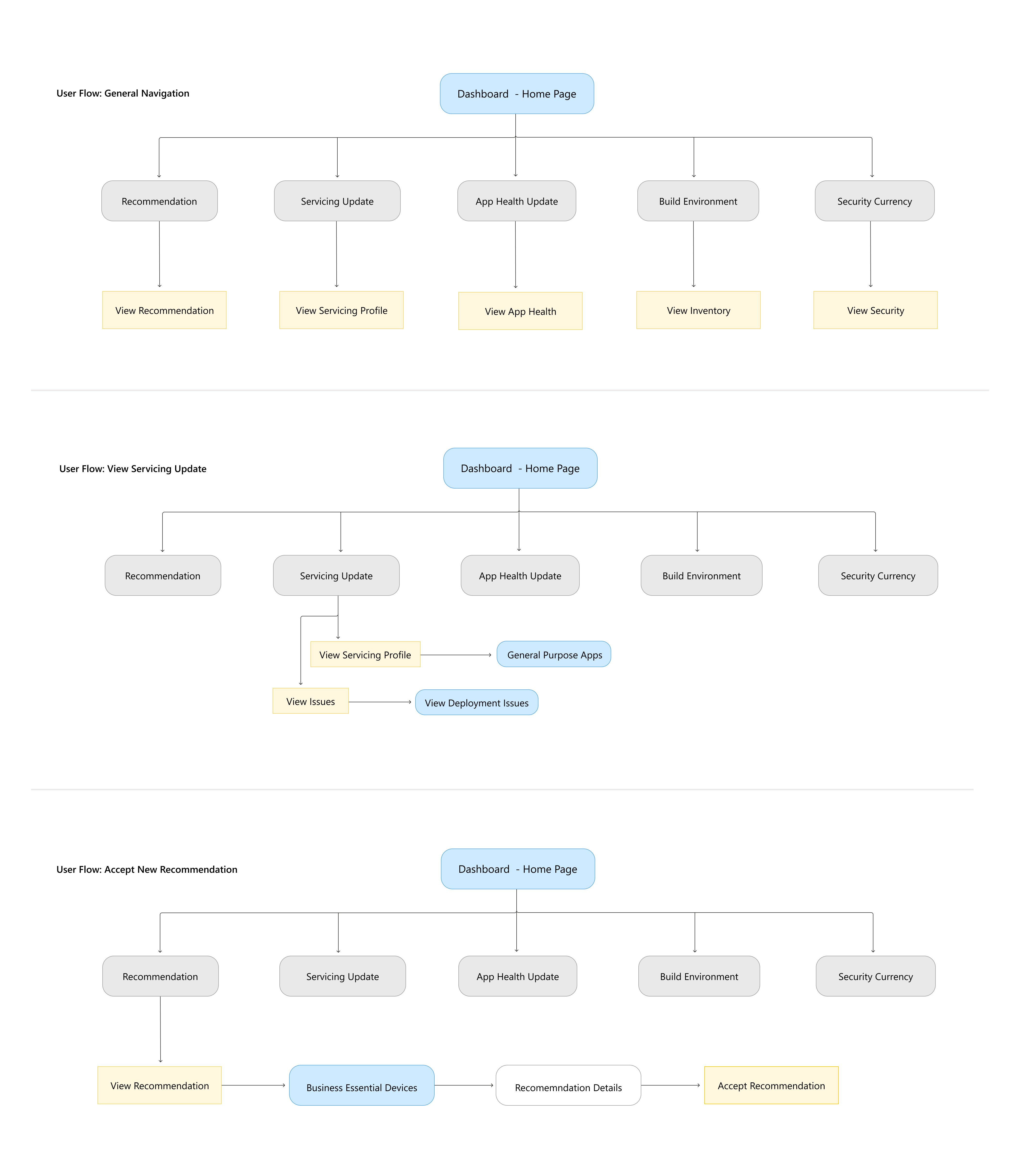
The user flows below support general navigation of the dashboard and two top tasks: viewing servicing updates and accepting a new recommendation.
Design outcomes
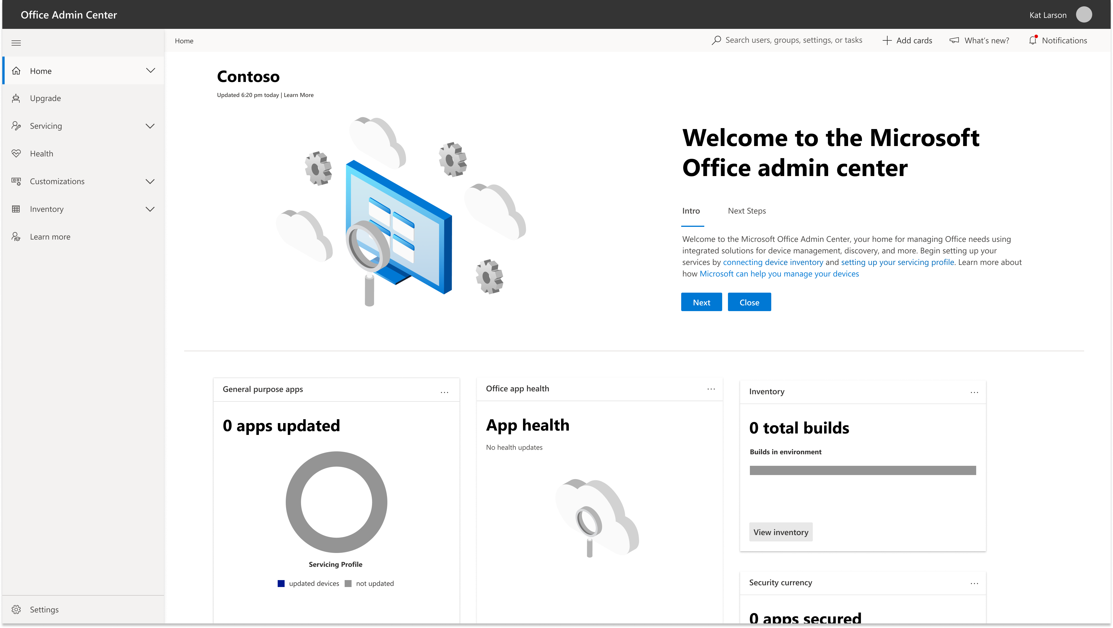
Onboarding Set-Up
When admins first land on the dashboard, they're presented with simple welcome banner that orients them to their new dashboard, recommending them to connect their device inventory, and set up a servicing profile.
Ready for release design
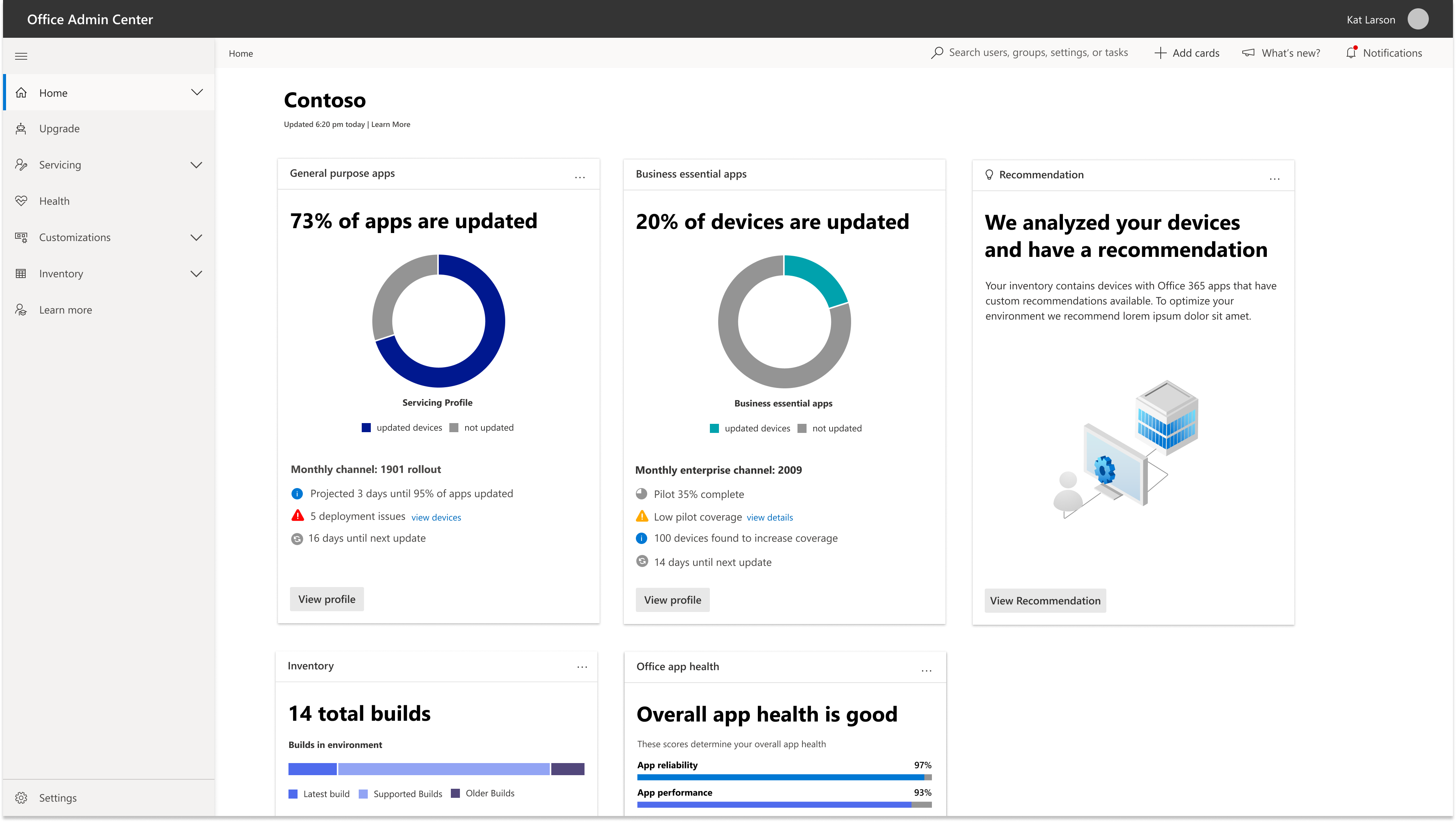
The card formatting and large data visualization provides admins with an at a glance understanding of their system. Admins can hover over the large data visuals to gain further numeric insights. Within let’s take a look into their servicing profile card they can see details on their update, insight about this profile to help work more efficiently, issues occurring within this profile, and when their next update can be expected. Clicking into the card takes admins to their servicing profile where all their update information is located.
Northstar Design
As the product expands, the north star design will feature an overview of admin’s high-risk business essential apps. This card will look familiar to the admins but also entail details about how their devices they are piloting before they rollout a massive update. Additionally, the recommendations card will expand to help admins work more proactively s as they build trust and confidence with the product. The goal is that over time, the admins will trust the recommendation card and look forward forecasting tips it will deliver. Over time it will become a routine card admins look forward to checking when they’re on the dashboard supporting a reactive workflow.
Final Reflection
Limitations
Given more time, I would:
Identify where unaccepted recommendations are stored and evaluate the types of recommendations that admins receive, to refine the recommendation system and improve its relevance.
Develop a dashboard card that helps admins discover new features and understand how to use Microsoft tools, enhancing the user experience and promoting underutilized tools.
Project Learnings
In the early stages of my internship project, I didn't have access to our admin user group for the first few weeks, so I relied on my design hypothesis and input from my team to guide my work. Making an initial wrong assumption can actually be beneficial, as it can lead to pivoting in the right direction and gaining valuable insights along the way.
When working remotely on complex products, don't hesitate to ask for help.